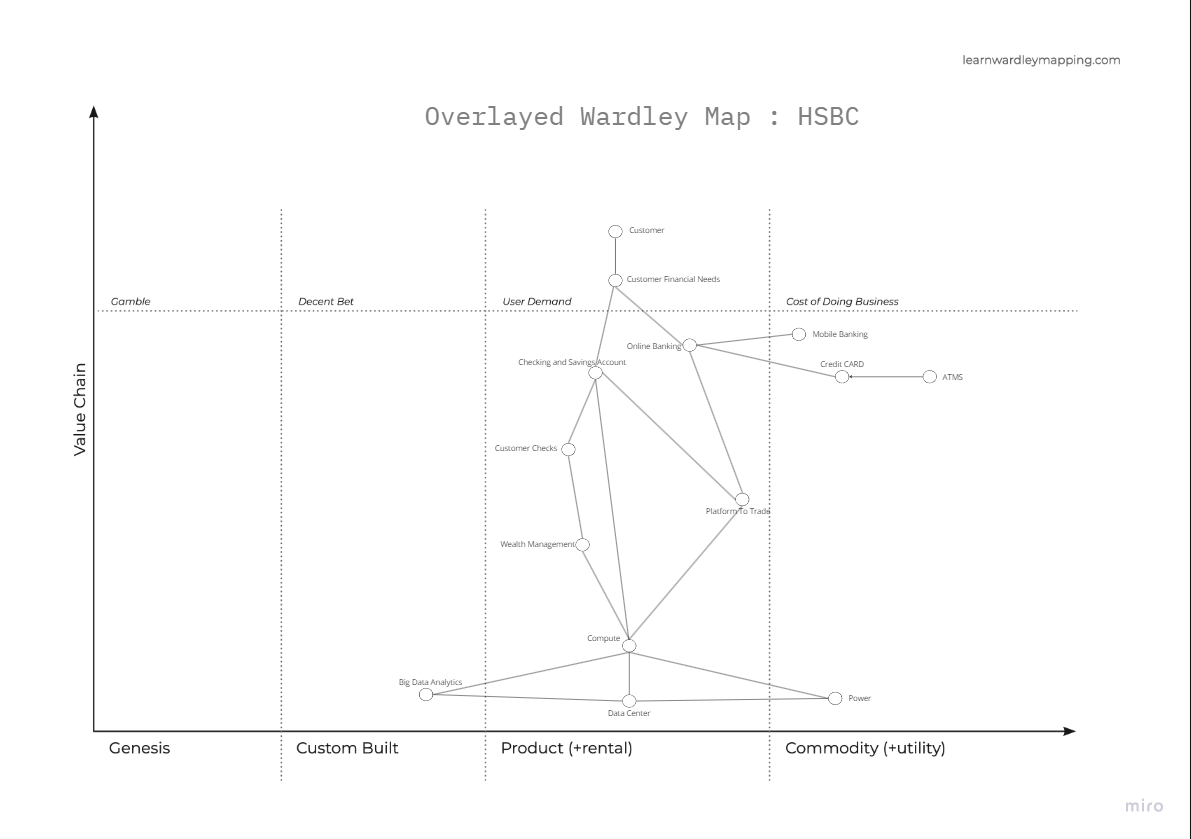
Wardley Map
A Wardley Map is a visual strategy tool used to map the value chain of a service or product to help organisations understand the landscape in which they operate. It identifies the components needed to serve the customer or user and maps them according to the value they provide and their stage of evolution.
Purpose
Wardley maps help people to understand the relative maturity of different components of a system, and to make strategic decisions about how to invest in those components. They are particularly useful for understanding which components are core to the business and which are commodity components that can be bought or built.
Format
A Wardley Map consists of:
- User Need: The customer or user need that the value chain is serving. This is placed at the top of the map.
- X-axis: The evolution axis, which represents the stage of evolution of the components from Genesis to Commodity.
- Y-axis: The value chain, which represents the components needed to deliver a product or service, ordered by their closeness to the customer.
- Capabilities: Components of the value chain, placed on the map according to their stage of evolution.
- Relationships: Arrows or lines indicating dependencies between components.

Anti-patterns
- Over Estimating Complexity: Mapping most items as Customer Built when products exist that can be bought.
- Over-complication: Making the map too detailed and losing focus on strategic insights.
- Lack of Action: Using Wardley Maps for analysis paralysis instead of driving strategic decisions.